
Color theory is set of rules that explains how colors mix, how they look together, and how humans perceive them.
Color theory is a powerful tool that bridges science and art. At its core, it is a practical guide that artists and designers use to choose the perfect color combinations to make their work look attractive and to communicate specific feelings. By understanding how colors interact and the emotions they evoke, one can create visually compelling and meaningful designs. Whether in art, design, or everyday life, color theory helps us communicate and connect through the universal language of color.
The Basics of Colors
The colors we see with our eyes originates from white light. When a light strikes an object, certain wavelengths are absorbed, and others are reflected, creating the perception of color. The visible spectrum includes colors like red, orange, yellow, green, blue, indigo, and violet. A glass prism separates white light into a spectrum of colors through a process called dispersion, which occurs because different colors of light bend at different angles when they enter and exit the glass.
In an empty vacuum or in the air, all colors of light travel at roughly the same high speed. However, when white light hits a glass prism, it passes from a less dense medium (air) into a much denser medium (glass). This transition causes the light to slow down and change direction. This bending of light when it passes from one material to another is called refraction. The key to separating the colors is that the glass slows down and bends shorter wavelengths more than longer ones.
Because a glass prism is shaped like a triangle, its surfaces are not parallel. When the light exits the opposite side of the glass back into the air, it speeds up and bends a second time. Because of the triangle’s shape, this second bend spreads the colors out even further rather than correcting them back into a single beam. What entered as a single ray of white light exits as a beautifully separated, multi-colored band known as the visible spectrum.
What is the Color Theory?
The colors created by refraction from a glass prism can be organized into a “color wheel”, a circular diagram that shows the relationships between primary, secondary, and tertiary colors. The color theory is originally established by Sir Isaac Newton in 1666 when he invented the color wheel. It serves as a foundational toolbox for artists, graphic designers, and creatives to communicate messages effectively through visual mediums.
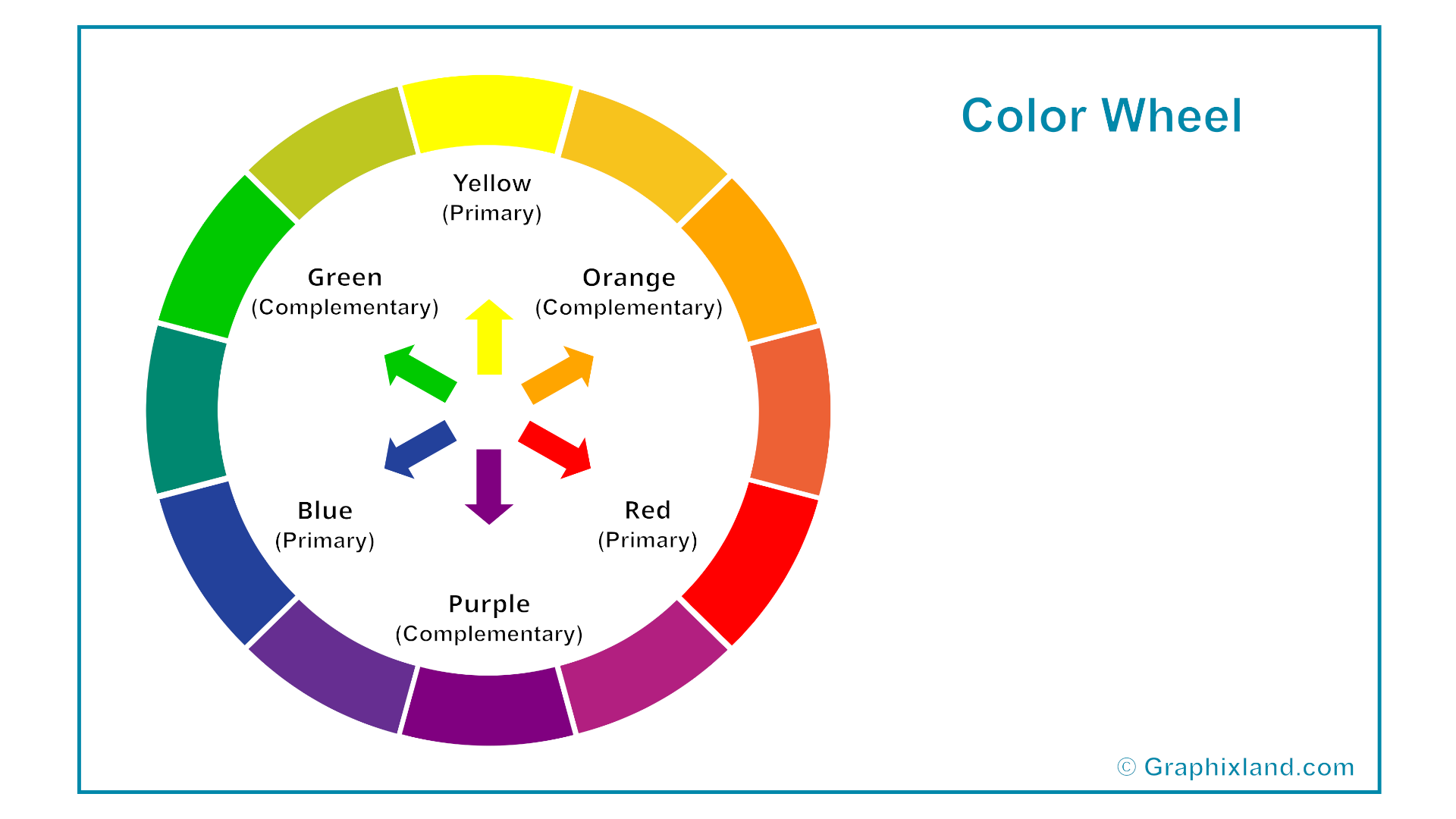
Primary Colors – Red, blue, and yellow. Primary colors are the raw, elemental hues that cannot be created by mixing any other colors together. They are the foundational building blocks of the color spectrum. Because they are the starting point of all color systems, primary colors are not “created” by a recipe or formula, they exist fundamentally as independent wavelengths of light or pure chemical pigments. Instead, primary colors are used to create all other colors.
Secondary Colors – Green, orange, and purple. Secondary colors created by mixing equal parts of two primary colors together. On the color wheel, they sit directly between the primary colors that were used to make them.
Tertiary Colors – Colors like red-orange or blue-green. Tertiary colors are the hybrid colors created by mixing equal parts of one primary color and one adjacent secondary color together. On the color wheel, they sit directly between the primary and secondary colors used to make them. Because they are blends of two distinct families, tertiary colors are named using a two-word hyphenated convention, always leading with the primary color first (e.g., red-orange, not orange-red).
While primary colors are striking and secondary colors are bold, tertiary colors represent the vast majority of colors we see in the real world. Designers aggressively use them because they look more organic, muted, and sophisticated than raw primary hues. Tertiary colors create smoother visual transitions, making them excellent choices for backgrounds, clothing choices in photography, and user interface design schemes.
Properties of the Colors
The properties of a color are the three distinct characteristics, called hue, value, and, saturation, that define how a color looks and behaves. These properties form the structural foundation of color theory and are used by artists, designers, and computer monitors to identify, measure, and modify any color in existence.
Hue – In technical and scientific terms, hue is determined by the specific wavelength of light reflected from an object. Hue is the origin of a color, representing its classification as a primary or secondary color on the color wheel. It is the attribute of a visual sensation according to which an area appears to be similar to one of the perceived colors: red, yellow, green, and blue, or to a combination of them.
Color Value – The definition of value in color theory is the relative lightness or darkness of a color. It describes where a color falls on a scale running from pure white to pure black, regardless of its specific hue or saturation. Value is widely considered the most critical property in visual art and design because it is what allows the human eye to perceive form, depth, three-dimensional volume, and shadow.
Color Saturation – The color saturation (also known as chroma or intensity) is the purity, vividness, or richness of a color. It describes how intense a color appears, measuring how much it departs from a neutral gray of the exact same lightness. A color’s saturation indicates how strong or weak the hue is.
Color Harmonies
The definition of color harmonies is the combination of colors that are visually pleasing and balanced when used together. It refers to the structured formulas and frameworks based on the color wheel that artists and designers use to create predictable, aesthetically successful relationships between colors.
In design, harmony implies that the human eye is satisfied by the arrangement. If colors are not harmonious, they are either bland (causing the viewer to lose interest) or chaotic (causing the viewer to look away because the contrast is too jarring).
Complementary Colors – Two colors directly opposite each other on the wheel (e.g., blue and orange). This creates maximum contrast and high energy.
Analogous Colors – Three or four colors sitting directly next to each other (e.g., green, yellow-green, and yellow). This creates a serene, natural, and calming effect.
Triadic Colors – Three colors evenly spaced in a perfect triangle around the wheel (e.g., purple, green, and orange). This offers a vibrant, balanced, and dynamic palette.
Monochromatic Colors – A single hue modified across various values and saturations (e.g., navy blue, sky blue, and baby blue). This delivers a clean, unified aesthetic.
Applications of the Color Theory
Color theory encompasses principles used in art, design, photography and various fields to create visually appealing and meaningful color schemes. The applications of color theory bridge the gap between human psychology and visual design, serving as a tool to influence behavior, evoke emotion, and improve usability across industries. Every time you look at a website, walk into a retail store, or watch a movie, you are experiencing color theory in action.
Photography, Cinematography and Filmmaking – Photographers, directors and cinematographers use color palettes to tell a visual story, build tension, or establish a movie’s timeline. Modern Hollywood utilizes the highly popular “Teal and Orange” complementary harmony. Skin tones (orange) pop dramatically against contrasting shadows and backgrounds (teal). Changing a character’s color scheme highlights their personal transformation. A famous example is in Breaking Bad, where the protagonist’s wardrobe shifts from dull, low-value beiges to dark, saturated tones as his morality degrades.
Marketing – Companies use color theory strategically to establish identity and subconsciously manipulate consumer behavior. Using a distinct signature color increases brand recognition by up to 80% (e.g., Target’s bold red, Coca-Cola’s energetic red, or Tiffany & Co.’s luxurious robin’s egg blue). Financial institutions and tech companies aggressively use blue to broadcast security, stability, and trust (e.g., Visa, PayPal, IBM, Intel). Retailers use high-contrast red and yellow harmonies for clearance sales, call-to-action buttons, and packaging to trigger impulsive purchasing decisions.
Interior Design – Architects and interior designers apply color theory to manipulate the physical perception of a three-dimensional space. Light values (tints) reflect light and make small rooms feel larger and more open. Conversely, dark values (shades) absorb light, making large, sterile rooms feel cozy and intimate. Cool colors (blues, greens) are utilized in sunny, warm climates to make interiors feel physically cooler, while warm colors (terracotta, beige) cozy up spaces in colder environments. Spas and healthcare facilities utilize analogous, low-saturation green and blue palettes to intentionally lower blood pressure and induce patient relaxation.






[…] The Color Theory: Understanding of the Universal Language of ColorBy GraphixLand | […]